Beibei Search
Redesign

ROLE: UX Designer, Initiator

DEVICE: Mobile App

DURATION: ~ 1 month

OverviewBackgroundData reviewResearchIteration1Iteration2A/B test
TELL A STORY
Imagine you are a new mother who is looking for diapers online with a little crying baby (This happened a lot when I did interviews with new mothers. Believe me).

When you open Beibei and tap 'diaper', you could see thousands of similar results. Suddenly your baby is crying and you need to place the order asap. However, you need to make a choice among thousands of similar results.

You might need to put aside the phone to feed your baby first, and next time, you will never get back to Beibei again. We are losing you!

It's not just imagination. IT'S ALL TRUE.
CONTEXT
Beibei was transforming from brand deal to marketplace platform, which indicates people were more likely to search.
Just after I joined Beibei as an interaction designer, Beibei started to transform the business model from a ‘brand deal’ to a ‘marketplace platform’. We aimed to be the 'Amazon' or 'JD' in the maternal and infants industry. The impact of 'brands' was weakened on the Homepage, instead, we developed different deals and promotions that guided people to focus on single products. Simultaneously, people's behavior pattern was also changing: when they were looking for a product, they no longer browsed by brands or categories, instead, they were more likely to search.
BLOCKER
However, the LOW conversion rate was the primary blocker.
Based on the literature research, a good average conversion rate of e-commerce search is assumed to be 10%(Amazon is around 12% and usually site search boosts conversions at 2-3x). We found we were far behind it.
OUTCOME
When done right, search conversion rates soars.
We leveled up the purchase conversion rate of search from 6% to 9% in high-value product types.
IMPACT
Built the long-term design strategy and motivated the company to set up an independent search product team.
#1 Metrics.
New mothers were searching for products for their kids.
About 70% of users were new mothers. They aged from 24-35 and lived in smaller cities. Our previous research showed our users were sensitive to price and good at comprising price between different apps.
Most of the time they searched products for their little kids, from new burns to early teenagers. Kids of different age range needs different products. Most of them had only 1 child.
Search funnel analysis: Key bounce rate and long decision making process.
What do they search for?
We counted TOP 100 search queries they typed during a typical month and ranked them by frequency.
What do they often use as queries?
Top1. Category Name, ex: parent-child clothing, baby bottle;
Top2. Brand Name, ex: Kao, Daphne, Pigeon;
Top3. Brand/Qualifier+Category Name, ex: new burn baby clothes, Pigeon baby bottle.
What do they usually look for?
Top1. Kids clothing, ex: parent-child clothing, girl dress;
Top2. Kids product, ex: baby bottle, toy, baby play mat;
Top3. Pregnancy product, ex: Maternity clothes.
#2 How to describe the search behavior in Beibei?
It's inspiring to observe how real users are using the search bar.
We quickly recruited participants we had known about. They sometimes opened Beibei and looked for something. Finally, 5 participants joined us in only 2 days, and we asked them to think aloud and:

1. Go through a complete search task in Beibei, like finding a product they recently looked for.
2. Go through the same task in another app they preferred, and talk about the difference.
Mental activities and physical behaviors in a search process.
Mental activity
It's the process that people think of and construct their search queries.

Need:
- Describe product correctly;
- Come up with the queries quickly;
- Input the queries fast;
- No typos.
Physical behavior
It's the process that people filter, sort the options, narrow down and compare the products.

Need:
- No irrelevant result;
- Narrow down the result quickly;
- Show them key information;
- Distinguish products with similar images.
Two different behavior patterns:
The 1st user story.
The 2nd user story.
A mother is looking for a dress for her 3-year-old daughter.
A new mother is looking for diapers for her new burn baby.
She wants to buy a new summer dress for her little daughter. She types 'dress' and finds various styles of dresses. So she adds a keyword to narrow the search results. Then she quickly clicks the results if she feels it fits her daughter. She looks at the picture and size. She will add it to the wishlist if it has the correct size.

She considers many factors such as material, size, and price. Finally, she chooses a blue dress made of pure cotton.
It‘s her first time buying diapers. She has learned some knowledge from online courses, so she already has a rough idea about brand and size. She wants to compare these brands, so she uses Diapers as a keyword to search all related products in Beibei. First, she filters out new burns’ size. Next, she tries to figure out the best deal.

She compares factors such as size, package, price, promotion. And finally, she makes a decision.
INSIGHTS
#1 People easily get overwhelmed at the result page. They want to narrow it down.
#2 The most common behavior to narrow down the result is to add another keyword in the search bar.
#3 People click on a cloth because of a distinctive style, a beautiful image, or a pretty model. And then, they will consider material, size, price, and reviews on the detail page. They pretty likely click several more products and compare among them.
#4 People click on a diaper because it's the specific product that they need. They already have knowledge about the brand, model, size, and material. They just want to find it as soon as possible. And the next concern would be package and price.
Other usability issues when they went through the search process.
1. As the data shows, most people who click the search icon want to use search instead of categories. There are some unnecessary clicks.
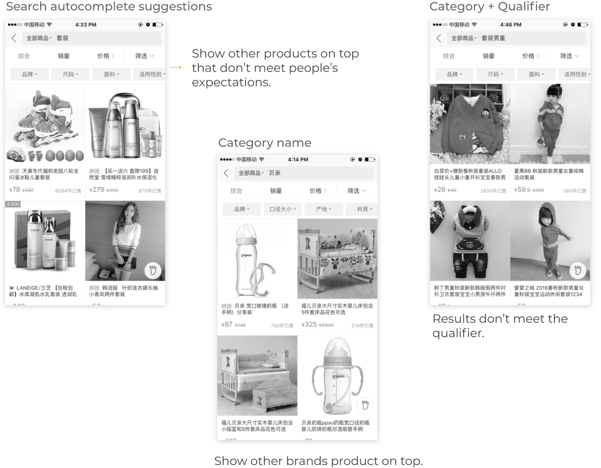
2. Unnecessary similar options in search autocompletion and irrelevant options increase the burden of selecting.
3. There are some irrelevant result on the top, which reduce peope's confidence of correctness.
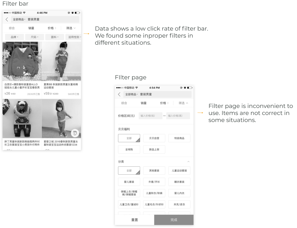
4. Filters sometimes are not correct and efficient.
#3 We aligned our insights to existing products.
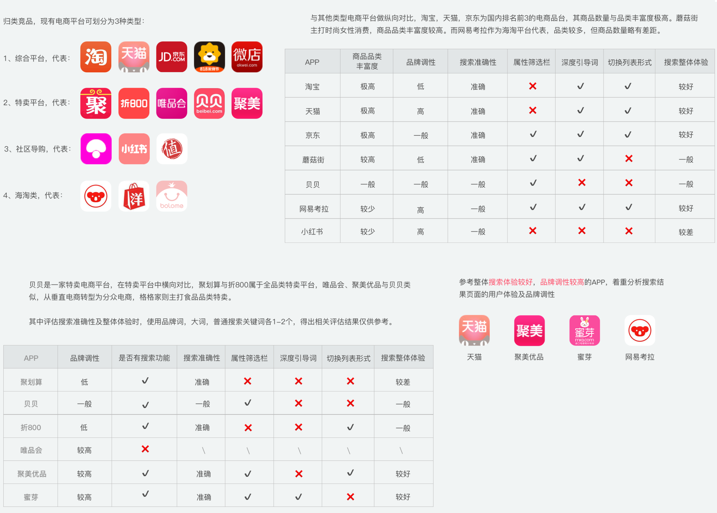
We selected 4 successful products existing in the market.
Step 1
Categorize existing products: horizontal e-commerce, best deal e- commerce, community-based shopping platform, international shopping.

Step 2
Compare Beibei with these apps by different features.

Step 3
Choose 4 best of them which generally provide better search experiences.
We got insights by the analyzing main pages in the search process.
Insights:
#1 Single-dimension autocomplete keywords reduce people's cognition load.
#2 Highlight word makes suggestions clear and easy to select.
#3 Limited suggestion numbers help people quickly make a decision.
#4 Prioritize suggestions based on people's mental models.
#5 Predict what people want when people input a vague word.
#6 Improve the algorithm of search result prioritization.
#7 A well-designed filter could help people find the product quickly.
#5 The first try to improve the search experience.
We collaborated with the other teams to drive a better search experience.

Merchant team: As people focus on images when viewing products, we set standards for product images and motivate sellers to modify some pictures that are not compliant. We also help the merchant team with writing to provide easy-to-understand filter names.

Develop team: We provide some principles and UX considerations to help improve the algorithm of the prioritization of search results to meet users' expectations.
Facilitate the mental activities of search.
The highlighted search bar provides an easy-to-access entrance for search, which reduces unnecessary clicks and, at the same time, tells users that there are increasing products in Beibei.
Simplify autocompletion page.
Help people quickly filter results.
High-frequent used filter options are listed at the top of the results. We also improve the writing of terms to make them easy to read and understand.
Add a filter page to provide an additional filter option.
Consider the use of space.
As the navbar contains too many features, when people scroll up to explore the products, they need more space to view more information on one page.
Design for extreme situations.
Don't let people down when there's no result under certain queries.
There was not a significant improvement in conversion rate.
As we reviewed this project, we found we raised the search's clicks rate and active time, but no noticeable conversion rate changes. A good filter could help people quickly browse the result page but still not enough to lead purchase.
#6 Further exploration on search.
As it didn't work or was at least not enough to help people quickly find a certain type of product, we started to think about how to help people make purchase decisions.

We need another try.
We dig deep into the search behavior patterns: People focus on different information when searching different types of products.
Based on the previous research of people's behavior on search, we noticed some people mentioned that they focused more on images in some cases. In contrast, others focused more on word info in other cases. We were curious why this happened. So we tried to test search ourselves.
We tried to search many queries and collected the result page, which we found all pages were designed as two-column layout, whatever we searched. And we found some pros of this:


Too many researches have shown that visual images are more appealing and effective than just written word when showing the style.
While, in other cases, products share similar pictures with only slight differences, such as the following:
We found that when people need to compare several attributes, like material, price, a specific feature, even the unit price, they can't find this information directly on this page.

They need to go back and forth between the search result page and the product detail page.
We decided to conduct an A/B test to test our idea and move on with the best design.

#1 Allow users to change the list design by themselves.
#2 Set different default list designs, according to different product types.
#3 Show different information, according to different product types.
#1 Allow users to change the list design by themselves.
Add a button to allow people to change the layout.

Purpose: Test if people are willing to change the layout and if yes, in which product categories.

Result: Few people(<1%) click the button and can not conclude a pattern.
#2 Set different default list designs, according to different product types.
Based on people's mental model, we filtered some categories which need single-line layout.
And then, we set the default layout of these products as a single-line layout. And others keep a two-column layout. To test if the layout can make changes for some specific types of product.

Result: View more product in single line layout(+12%), no difference in purchase conversion rate.
#3 Show different information, according to different product types.
We designed to directly show important attributes that people matter when searching these product types in two-column layout and single-line layout.
For standard products, like milk powder, diapers, infants' supplementary food, we use a single-line layout as default.
For other standard products, we designed a general single-line layout as default.
For non-standard products, we set a two-column layout as default.
Some findings from the final A/B test:

There was no noticeable difference when we tracked the data of design#1 and design#2. But for design#3, when we tested the milk powders, we find a significant increase on purchase conversion rate(from 6% to 9%).