Beibei Seller Central 2.0

OverviewContextOutcomeKickoffSign-upNav/HpagePromotionInventoryS-collegeEnd
Overview
Maternal and infant products consist of many categories and subcategories, allowing thousands of sellers to run their businesses on Beibei. The platform where sellers work every day, called the Beibei Seller Central, is a complicated system with many features and allows sellers to get all jobs done in it.

When sellers log in to Seller Central, they need to create the most significant profits with the least cost and time. Thus, it should be clear and neat with the most efficient workflow.
My Role
I led the design of sellers' experience during 2017-2018 in Beibei and worked alongside several product managers, marketers, and developers who all came from different product teams.

I initiated this project and led the research and design part.

I have omitted and obfuscated confidential information in this case study. All information here is my own and does not necessarily reflect the views of Beibei.
CONTEXT

In just two years since 2014, Beibei, with a B2C business model, had transformed from a vertical e-commerce platform to a horizontal e-commerce platform with about 1 million daily active users.

We were still looking for possible growth and expanding the products categories. And thus, we planned to recruit more sellers/brand shops and test more sales promotion ideas.
BUSINESS GOAL IN A WORD

Focused on increasing the number of sellers and the number of products for sale.
ALIGN DESIGN STRATEGY WITH THE BUSINESS GOAL

#1 As the merchant team was preparing to recruit sellers, we considered facilitating them onboarding seamlessly on our marketplace to effectively incorporate new sellers, ensure ongoing satisfaction and prevent dependency on the additional manpower.

#2 Once they get familiar with the Beibei, they need to start and grow their business by running marketing and promotional campaigns. As the whole marketing team focused on building and testing various promotional campaigns, we needed to optimize the entire selling experience.
This is what we achieved.
#1 Onboarding
1. Revised registration process and improved efficiency by 52.4% and first-attempt success rate by 27.2%.
2. Optimized navigation system and homepage. Increased navigation efficiency by 31%.
3. Provided training and help center to reduce onboarding time and labor support.
#2 Selling experience
1. Improved sellers satisfaction of sales promotion management by 25%, and the number of sellers that created sales promotion by 30%.
2. Enhanced listing items efficiency by 50%.
How did we get there?
Kickoff
At the outset of this project, we didn't have a clear mission for sellers' experience, even didn't have a clear picture of sellers persona. So it's necessary to gather information and build empathy with sellers.
We tracked sellers data
We talked with real sellers
We observed how they used the Seller Central
We got some early insights from the field.
Two main seller types: Small sized independent Brands and big-sized resellers.
Independent Brands
Resellers
These sellers are relatively small-sized companies that Beibei supported early.

Because of the scale of the business, they don't have many employees. Maybe only one of them works on the Seller Central.

And mostly, they have little knowledge about running a business online, and they need trains and guides.
Resellers as the distributors of big brands, and most of them migrated from other e-commerce platforms. These sellers are relatively big-sized.

There would be more than one person working on Beibei Seller Center in these companies, so each of them has specific responsibilities.

The employees are often well-trained, skillful, and experienced.
Fewer resellers created more revenue and attracted more customers.
Independent Brands
Resellers
70%
15%
30%
85%
Amount
GMV
Amount
20%
40%
80%
60%
Orders
Amount of Products
WE DECIDED THE PRINCIPLE:

#1 Focus on resellers and give priority to their demands.
#2 Provide training and guidance for smaller-sized sellers.
We summarized sellers' pain points as: 'efficiency' and 'support'.
After talking with sellers, we described their journey map in Beibei Seller Central, which also indicated the life cycle. Even real sellers worked with us when creating this journey map.
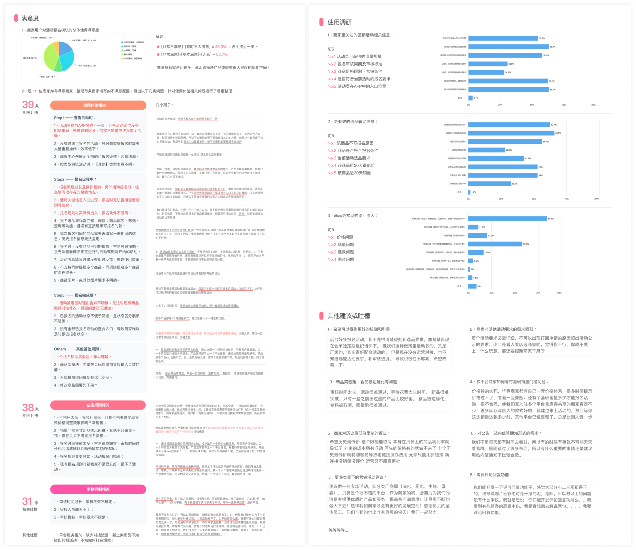
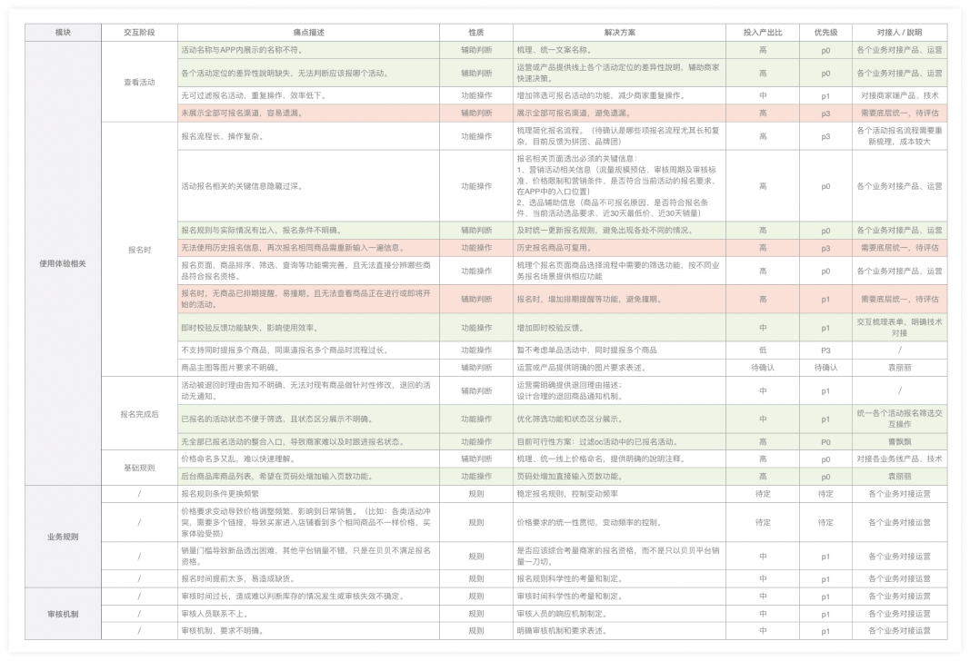
We also collected sellers' complaints from the merchant team.
#1 Sellers need training and guides.
"You have a lot of deals and promotions that we could join in the Seller Central, which is good, and we have the ability to participant in these promotions. While, the problem is we have no idea about the eligibility and the review process. We need someone who can facilitate us or any other kind of help that works."

-- An anonymous seller
#2 Sellers strongly require a clear eligibility description.
"The requirements must be clear and detailed. Please don't reject me for the reason that I've never known before. Please, don't let it happen again!!!"

-- An irritated anonymous seller
#3 It's hard for new listing items to make a good sale, and some categories are marginalized.
"Review is time-consuming and hard to pass, which is not reasonable. New listings can't have a good sale for some reason, and it's not good for growth."

-- An disappointed anonymous seller
#4 Basic sales threshold is not reasonable.
"Sale price is tightly controlled now! Most sellers have their pricing system, and we can not offer a much lower price than the previous sales price. And basic sales threshold is also not fair. We have a lot of products that sell well on other platforms, and when we come to Beibei, it still needs sales threshold."

-- An anonymous seller
#5 Sellers call for canceling the 'the lowest price history.'
"Our profit margin is tiny in Beibei. When the cost fluctuates, we can not sell at that price. And the problem is when we create a new link for the product, the new link without too many sales can not pass the review."

-- An anonymous seller
#6 Notifications or messages should be more helpful.
"We don't have too much time viewing group messages every day. Sometimes we miss a lot, and if you could send it as the announcement or notifications in Beibei Seller Central, that would be helpful."

-- An anonymous seller
#7 More sale events under each categories.
"If there could be more sale events for different categories every week, that would be amazing!!!"

-- An anonymous seller
#8 Sellers need to reply to customers' comments.
"Every time I see some comments that are bad but untrue, I want to reply to them and tell the truth."

-- An anonymous seller
STAKEHOLDERS BUY-IN

Almost every slight change in Seller Central would somewhat effect other features. We need to make consent among different teams.

To have stakeholders' buy-in, we ask marketing people to work with us from the beginning and update each step's result to the whole team. We validated the project's business value and set the timeline to meet everyone's expectations.
Based on the limited resources we could put into this project every sprint, we separated the whole project into several sub-projects and decided to conquer each by each.
1
Registration
2
Nav/Homepage
3
Sales Promotion
4
Inventory
5
Sellers College
#1 Registration: We simplified the process and provided support.
Data review: 50%+ sellers failed in first-attempt.
Reasons:
1. 30% didn't know that they were ineligible to start selling in Beibei, so the merchant team rejected them.
2. 40% stuck in the review process because they missed necessary information or uploaded false documents.
3. 15% left the registration process at some points.
Let's go through the redundant and inefficient registration process.
Sign up
Get-started
- Sellers had to fill in a form with more than 50 items. Some of them we even didn’t need.
- Sellers had to complete 9 steps, a long workflow that caused high exit rates.
- Sellers had to wait for 2 reviews, which usually took 24 hours for each review.
- Lack of information and support on necessary steps, which caused many failed cases.
We created a concise 3-steps registration design.
Design:

- Provide onboarding support during the entire registration process.
- Created 3 steps registration flow and deleted 20+ unnecessary items.
- Provide template and examples to help fill the form.
Design:

- Provided 1 time quick review.
- Show clear review status and help info.
Design:

- Decoupling preparation works from the main quest.
- Canceled or delay unnecessary work and allowed sellers to explore complete Seller Central asap.
IT'S A SCALABLE DESIGN.

As the business continued to be more complicated, we iterated a lot of features on the registration process. This design structure is strong enough to support the additional features we added.
#2 Nav/Homepage: We improved the navigation efficiency.
IMAGINE YOU WERE A SELLER.

You want to add a new product. First, you have to find 'PRODUCT MANAGEMENT' out of 11 items on the navigation bar and select 'Add a Product' from a long drop-down menu. Would you be happy if you had to do the same thing numerous times every day?
We found it essential to redesign the information architecture.
#1 Information Architecture
They:
- CAN NOT quickly find the features they need.
- CAN NOT immediately understand the meaning of each title;
- CAN NOT effectively switch among commonly used pages.
#2 Homepage Layout
They:
- CAN NOT navigate effectively with the crowded navigation bar;
- CAN NOT identify the most critical information;
- CAN NOT make the best use of space in homepage.
Sellers already had a mature mental model.
As many e-commerce companies thrived in China, and most resellers also ran their business on other platforms simultaneously, the competitive analysis would effectively get insights into how sellers understand the Seller Central.
MEASURE SUCCESS.

It's vital to set data metrics to measure the success of homepage redesign. Considering the business plan of recruiting more sellers, we initiated this design project to improve the navigation efficiency. So finally, we decided to use the metrics of the average time sellers leave homepage to a new subpage.
Design principles: clear/effective IA and simple/smooth interaction.
This is also the principle we followed when we did self-check after design. We also kept it in mind even during the other design projects related to the Seller Central. It had been a general principle for Seller Central design.
How did we solve these problems?
#1 We shallowed down the information architecture.
Based on the seller's mental modal, using frequency and advice from the marketing team, we listed all features in the Seller Central and did the cluster. We defined the primary and secondary navigation to ensure sellers could access every content in a smooth flow.
Before:
After:
#2 We created efficient and straightforward navigation.
We expected navigation system could be scalable and provide more space for growing content. We had several different plan and conducted user test on each design.
Through usability test, we found that compared to the original design:
- Sellers still felt confused when looking for some features.
- It took some time to complete a task.

Other problems of these designs:
- Navigation bar was still unscalable in plan3 and plan4.
- Navigation system was complicated.
We decided to design a vertical navigation bar along the left edge of the page with a highlighted design where sellers could find all features. And the navigation bars were shown on every page in the Seller Center.
Before:
After:
#2 We redesigned the homepage.
These are several plan we tried.
We talked with several sellers during the design, but they helped me figure out the prioritization of homepage content. We tried to do an A/B test and were told we didn't have enough time and resources. Finally, after several rounds of discussion with the marketing and product team, we launched the final design for sellers. It's a long story to prioritize and balance different teams' benefits.
#3 Sales promotion: Make it smart and efficient.
Most sellers used to complain about it. We needed more detail.
Research Goal
Questions Design
Based on the data we already had:
- Only about 40% of sellers used to join or create sales promotion;
- Among them, only 50%-60% of sellers could successfully run the deal or promotion;
- Only small part of products were eligible for deals and promotions.

We need to find the reason of these problems.
We listed some key points that we wanted to know. And then, we designed questions and created a questionnaire.
We collected 8 serious usability issues, 11 optimizations, and 9 regulation problems throughout the entire process.
About 200 sellers took the survey. We listed the information and summarized insights in a report and sent it to the stakeholders.
Feature list.
After discussing with stakeholders, we translated the report to a feature prioritization. This simple but effective framework helped us bridge user needs with product features.
DESIGN IMPACT.

Besides perfecting the design, we also tried to help the marketing team achieve their goals. As we found many issues related to the marketing team, we redefined product details with the marketing team. We created a consistent system for promotion activities, which significantly improved the communication efficiency and reduced sellers' cognition load.
We quickly created a concept in the meeting to ensure what we wanted.
Step #1 Find the promotion
Step #2 View the detail of the promotion
Value:

1. Provide all available promotions on one page to help sellers quickly find and remember the promotions they need.

2. Differentiate promotions and deal events to help sellers better understand each type.

3. Call-to-action for joining the promotion.
Value:

1. Directly tell sellers where's the promotion in mobile app.

2. Collect and show all information and requirements about the promotion.

3. Call-to-action for joining the promotion.
Step #3 Choose eligible products
Step #4 Configure product detail
Value:

1. List eligible products to help sellers pass the review.

2. List ineligible products and ineligibility reasons to help sellers understand where they could improve.

3. Allow sellers to choose multiple products to increase efficiency.
Value:

1. Allow sellers to configure multiple products on one page to increase efficiency.

2. Auto-fill the configurations form by history record to increase efficiency.

3. Show instant feedback when making mistakes to help sellers submit the form quickly.
Tested the wireframes/user flow and received some feedbacks.
#1 Sellers need more motivation to join Beibei promotion events.
"Small brands don't have too much experience on promotion or deal events. They need to know which one works best and the highest sales performance of other sellers."

-- A marketer who manage seller services
#2 Sellers need to know what other sellers are doing here.
"I can only see my product and sale performance but have no idea about what others are doing here. I don't know if I am doing well in Beibei promotions."

-- A small-size brand seller
#3 Sellers need to know latest news about different promotions.
"We always published an announcement on seller central Help Center, but it seems most sellers can't see that. That reduces our productivity because we need to explain the same thing over and over again."

-- From seller services team member
#4 Sellers need exact indication about the eligibility of a promotion.
"Sometimes, the requirement is too vague to follow. I still don't know if I am eligible for certain promotions or deal events."

-- A small-size brand seller
#5 Sellers need to know what to do as next step.
"What will happen after I add some products to the promotion?"

-- A seller
#6 Sellers need a quick way to continue adding products to promotions.
"We can try to provide a short-cut feature to help sellers add more products to promotions or deal events."

-- A product manager
STAKEHOLDERS BUY-IN AGAIN.

We showed the wireframes to the actual user to make sure it meets sellers' expectations, and we also confirmed the plan with inner stakeholders again to make sure it is viable in business scope.
The design we finally launched.
#1 Promotion Homepage.
#4 Promotion Detail Page - Product Eligibility
#4 Join Promotion- View Ineligible Products
#7 Join Promotion - Complete
#9 View Promotional Product - View Detail
#11 View Promotional Product - Edit SKU Info
#2 Promotion Detail Page - Promo Info
#3 Promotion Detail Page - Seller Eligibility
#5 Join Promotion- Select Eligible Products
#6 Join Promotion - Configure Product Detail
#8 Manage Promotions - Promotional Product List
#10 View Promotional Product - Edit Detail
MEASURE SUCCESS.

After Launched the final design, we also kept the entrance of the old version. Finally, we found more than 70% of sellers choose to stay with the new version. We also sent a survey to learn sellers' satisfaction rate of the new version, and we were so glad to know that compared with the old version, satisfaction has been increased from 46% to 71%.
#4 Inventory: improved adding products experience.
We tracked the user data and found the most time-consuming task - Adding Products.
In this part, we found a critical interaction, adding products, which consumed a lot of sellers' time. That's reasonable because the center of e-commerce is products. Sellers add products, edit products, and check the status of products every day. It consists of the primary part of their daily work.
4000+
25min+

Number of products added manually every day

Average time sellers spent on adding a product manually

PUT OURSELVES IN THE SELLERS' SHOES.

As it was a form redesign project and we needed high ROI in this project, we didn't invite actual sellers to go through the form-filling process in front of us. Instead, we observed each other trying to fill the form with real product information and noted down the problem while we were filling the form.
Our findings through the 'fake' usability test.
#1 Filling the form means an enormous workload.
40+ Items in this form include product name, attributes, picture, prices, inventory, size, shipment info, and so on.
#2 Double-check is still needed after automatically bulk importing products info.
We need to correct the mistakes and errors manually to avoid affecting sell performance.
#3 People sometimes misunderstand some items and instructions.
Form items are fragmented and not arranged in a well-organized way, which causes confusion and misleading.
#4 There are the same UI components with different interactions.
Misused components and inconsistent design also cause confusion and misleading.
#5 Too many unnecessary descriptions interference.
Feel hard to read a long instruction and never know the key points.
#6 Can not submit the form successfully.
There is no real-time feedback for mistakes and errors, too many unfixed bugs, and poorly-designed error messages.
How did we solve the problems?
#1 Redesign the information architecture.
Based on users' mental models and behavior patterns, we grouped relevant items and adjusted the order. Thus, sellers don't need to follow a mass flow or constantly scroll up and down to double-check their input.
#2 Make the design consistent.
Redefine the design component of each item and make them consistent through a redesign. Thus, sellers would have a consistent experience filling the form and reducing mistakes.
#3 Do trade-off on information delivery.
We highlighted essential tips and critical points and hid or deleted redundant information to neat and clear the web page. We aimed to reduce sellers' cognitive load by using good writing.
#4 Redesign feedback system.
We tested every items and status to revise inappropriate feedback messages and design. We decided to create real-time feedback and also designed a consistent feedback system.
#5 Sellers College: we launched an MVP.
IT'S A DESIGN FOR THE FUTURE.

We had many small-sized sellers that desired fast growth in Beibei. They lacked experience in the e-commerce business and had no idea how to grow their business online. They were also the potential growth of Beibei.
Context.
#1 Sellers service team spent a lot of time answering seller's questions every day.

As research showed before, it took these team members the 2nd longest time answering sellers' questions every day, and most of these questions were similar and repeated. They were frustrated with this work, which slowed their work efficiency.

2nd

Time-consuming work in the seller service team

40%+

Team members complained about repeated work

#2 Increase the percentage of new sellers who require more guidance and help on their business.

As more and more sellers start selling in Beibei, they need a quick way to learn how to run a business online and various rules and regulations on Beibei. The seller service team couldn't afford the workload without hiring more people.

35%

New sellers after expanding categories

DEFINE GOALS.

#1 Reduce the workload of the merchant team and customer service team.
#2 Create a plan to help sellers grow their business on Beibei.
Competitive analysis.

As it was a new system design for Beibei, we analyzed how other companies helped sellers grow.

We discussed these insights with marketing team.

We got some insights after competitive analysis and feedback study.

And we also define different types of tutorials for different seller levels.

Time is important.
The plan was delayed because marketing team couldn't provide enough content at that time. But after several months they told me they wanted to move on this project and got prepared.
MVP design.
What did I learn from here?
#1 Uncertain factors in cross-department communication exist everywhere, which requires your ability of managing resources that could contribute to this project. Get prepared as much as possible.
#2 Design for your users. But design is also a tool to help achieve the business goal. Follow business strategy and make design strategy, which should be the primary concern before starting a big design project.
#3 You always have blockers from someone outside. Try to find motivations and values for them and work together. Turn your blockers to your co-workers.
#4 Communicate as frequently and quickly as possible. Update every day or every meeting. Get feedbacks and move fast.
New Lands.
Beibei Seller Central improved a lot, so did our team.

This big project allowed me to communicate with various people and learn how to persuade them to buy in when we couldn't reach a consensus. Design value is powerful, and it exists everywhere. I believe what we had learned from this project values much more than the data performance I show above.